In a strategic move toward emotionally charged design, Bluetext argues that every element of visual experience—color, shape, layout—can and should be used deliberately to affect buyer behavior.
The Role of Color in Buyer Perception
Color isn’t just aesthetic—it carries emotional weight. Contrast, saturation and balance affect how visitors feel: confident and focused, or uncertain and distracted.
For example, a sustainability‑oriented brand might lean into greens and soft tones to convey responsibility and calm. The right palette helps visitors feel aligned and ready to act.
Why Curves Feel Safer Than Corners
According to Bluetext, shape matters. Rounded edges and curves are perceived as friendly, approachable and low‑friction; whereas sharp angles communicate precision, caution or distance.
Buttons, containers and images built with curves subtly encourage interaction—valuable in B2B‑tech or omnichannel retail contexts where trust and clarity matter.
Structure, Flow and Emotional Tone
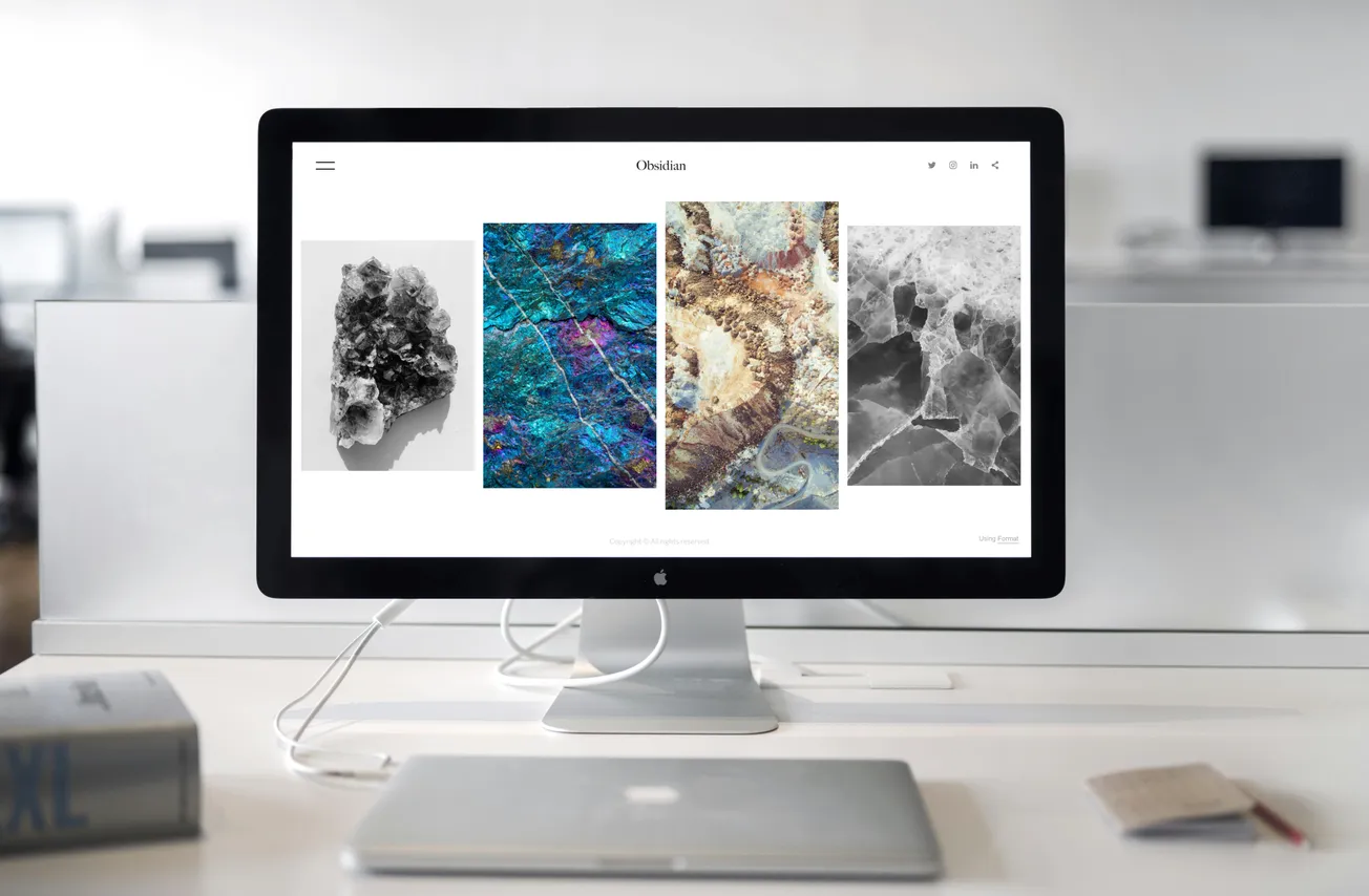
Design is more than color and shape: layout, whitespace and visual flow set the emotional tone of a page. Bluetext notes that balanced layouts guide attention naturally; clutter leads to frustration. Aligning visual structure with the buyer journey creates a subconscious flow that supports engagement.
Emotional Design in B2B and Omnichannel Retail
Even in B2B environments, human emotion is in play. Bluetext highlights that decision‑makers respond to emotion: subtle design cues like consistent shapes, clean layouts and appropriate accents signal authority yet approachability.
This is especially relevant for suppliers working with large omnichannel retailers who must appeal both to tech buyers and broader stakeholders.
From Aesthetics to Measurable Impact
Bluetext argues that emotional design isn’t just theory—it’s measurable. Key indicators include bounce rate, scroll depth, form completions, heatmaps and brand recall.
With data in hand, design moves from decorative to strategic—becoming an engine of conversion.


